33 trends in graphic design 2020
33 trends in graphic design 2020
2020 opens up new opportunities for designers to prove themselves. Today, graphic design trends are truly striking in their beauty and novelty. Let’s see how designers can surprise us this year.
We have selected TOP 33 design trends that will be popular in 2020. This will allow you to be in a trend and create unique copyright illustrations.
Table of contents:
- Darkness: a bit of mysticism
- Paint strokes: give the project a human soul
- Neo Geo: A New Conceptual Movement
- Mary Jane: keeping up with the law
- The distortion of space and time
- Optical Illusions: Delay the Viewer
- Color background: even more color
- Dada: returning the Vanguard
- 2020 packaging design
- Animated Letters: Innovative Marketing
- Cropping: mosaic, collages and surrealism
- Pharmacist: the maximum of minimalism
- Numbers, numbers, numbers.
- Open Composition: Go Beyond
- 3D: the depth of a new generation
- Antigravity: Flying and Floating Elements
- Vivid colors: a journey into the world of wonders
- Metallic: More Shine
- Liquid: let it flow
- Big text – big impact
- Contour typography: empty letters and numbers.
- Typography with background: retro inspiration.
- Alternative art: strokes, spots, scribbles
- Realism + two-dimensional drawing: combine opposites
- Asymmetry: disable grid
- Art Deco: minimalism and luxury
- Medieval Art Nouveau: vintage color palettes
- Duoton and gradients: two-color color transitions
- Warm, pastel colors: less brightness and color
- Maximalism + subtlety of lines: gain trust
- Serif font: give the letters character
- Isometric Design: 3D in Two Dimensions
- Color of the year 2020
- Darkness: a bit of mysticism
We start our list from a rather unusual and characteristic trend in graphic design. Darkness is a bold challenge to create catchy illustrations. Dark tones enable the designer to play with the depth of the image, changing the shades and textures of black elements.
The Darkness Trend in Graphic Design
Apple has begun releasing devices on the new Mojave operating system, which for the first time offers dark mode. The dark colors in the products convey luxury and premium design. They can also convey radical feelings of biker style. Moreover, darkness can cause the viewer a sense of ominous bewilderment, fear or mystery, so you should be careful with this technique.
This is a really interesting trend, which has recently been seen more and more often.
02.Paint strokes: give the project a human soul
Watercolor strokes in the images give them a sense of handwriting, which creates a level of humanity in the design. Black, gray and color strokes are very different from classic typography. Digital fonts familiar to everyone make illustrations dry. Watercolor brushstroke, as if drawn by hand, can truly bring your project a human character and soul.
Paint strokes in design.
The big advantage of the trend is that it adds energy and movement to static layouts. There is a wide range of strokes of this kind: from careless lines to splashes, from calligraphy to picturesque and even children’s sketches. Therefore, watercolor strokes can be used in print and packaging, in web design and advertising, in video clips and promotional videos.
- Neo Geo: A New Conceptual Movement
Neo Geo is a geometric conceptual art movement that dates back to 1986. It was created under the influence of earlier movements such as minimalism, pop art and op art. Today, Neo Geo is rightfully considered a separate movement in art, which has its own distinctive features.
Neo Geo style in design
In Neo-Geo style illustrations, you can see hints of Memphis design. This style allows you to combine the playfulness and rigor of the elements. Illustrations often use vibrant colors, abstract and geometric shapes, and three-dimensional elements. Neo Geo’s style was often used to design vinyl records in retro times. Today, this style is most often used in the design of packaging, book covers and music albums.
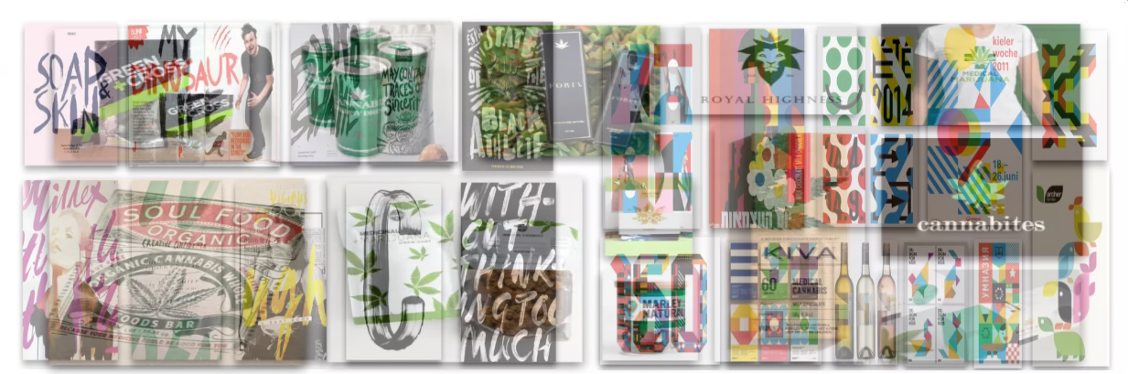
04.Mary Jane: keeping up with the law
Recreational use of marijuana is becoming more common. Today it is legal in eight states in the United States and in more than ten countries. In addition, the trend is only increasing every year. There are whole design agencies that specialize in marketing the marijuana product industry.
Graphic Design Marijuana
This is the startup gold rush. The medical marijuana industry has just begun its development, so designers have unlimited space for creativity. Packages of marijuana products are relevant to the industry. But we are not talking only about marijuana as a product.
Today you can see a huge amount of alcoholic and non-alcoholic drinks with extracts of a miracle plant, pastries with the addition of marijuana and other products. But the style of Mary Jane is also often found on clothes, shoes, accessories and other products that are not directly related to marijuana. Therefore, do not be afraid to make bold design decisions, but keep up with the modern world.
- The distortion of space and time
The deformation of time and space, like no other design move, attracts the attention of the viewer. You can change not only the speed of information transfer, but also the time the viewer perceives the illustration. An optical game with typography will make the viewer linger longer, take a closer look at all the elements of your creation.
Distortion of space and time in typography
It is also an element of fun and playfulness. Static artwork can be given movement and speed. The text can be distorted more than once, which will create a feeling of multiple changes in speed or relief of space. It is also a great way to highlight individual words or letters in typography, to give them a different character.
- Optical Illusions: Delay the Viewer
The previous trend in design can also be attributed to the “optics”. The tendency of the deformation of time and space is an optical art, tricks of perception that make people look at an illustration longer. Reception manages to be used correctly only by experienced designers, but having mastered such a technique, you will quickly rise above competitors.
Optical Illusion Drawings
Optical illusions can be trip or psychedelic. But they can also be a kind of scientific technology that uses the Archimedean spiral or other complex geometric shapes. Therefore, this trend has many variations with which you can play, and all this is based on the optical play of space.
It is important for designers and artists not to overdo it with optical illusions in their projects.
- Color background: even more color
Using colored areas in the illustration may make it look a bit like a periodic table of Mendeleev’s elements. Especially if you use the Helvetica font for typography. Such images look minimalistic, and surprisingly combine rigor and playfulness.
Colored fields in graphic design
Chopped font on a colored background is easily perceived by the viewer. Therefore, you can use a large number of different colors in one image. So you add energy to your work, preserving its lightness, and most importantly – with taste. In 2020, we will often see colored fields in advertising, packaging, magazines and digital publications.
- Dada: returning the Vanguard
Dada, or Dada, is an artistic movement of the European avant-garde that originated during the First World War. Around the same time, Russian constructivism was born, which offers a completely different worldview. Artists painting in the style of Dada rejected logic, created a new aesthetic. It was a struggle with capitalist society, a breakthrough into a new world.
Dada style in design
Today we notice a similar trend when graphic designers emphasize nonsense, irrationality, and protests against standards. Chaotic figures, a mixture of photos and drawings, distortion of reality will make your creation authentic. It will show your design character and courage. But the style of Dada requires the skillful hand of the designer, because overdoing it with absurdity is extremely simple.
- 2020 packaging design
A sample of any product is illustrated using textile patterns in CAD. If the product line has a fairly wide range of tastes, aromas or other characteristics, you have a great opportunity to attract customers.
Packaging Design 2020
The different design of the goods of one brand will help to better highlight the unique features of each product. This method is often used in the manufacture of cosmetics, chocolate, ice cream and alcohol. When a customer looks at a range of products that have incomparable packaging designs, this creates a sense of personality. In addition, this technique will highlight your brand among competitors’ products.
The main advantage of this trend is the possibility that the packaging will suit the mood or character of the buyer. Your product can emphasize the personal style of the buyer. And this creates a kind of emotional connection. Therefore, in 2020, it is worth paying special attention to the design of packaging.
- Animated Letters: Innovative Marketing
Without a doubt, motion design will be in trend for many more years. And relatively recently, it began to be used even in email newsletters. Increasingly, you can find emails that include animated GIFs. Sometimes they play for a very long time, but still give their effect.
Email Animations
Most often, animation is used only to highlight the logo. For example, motion logo can even be seen in conservative publications like the New York Times. Their mobile application uses animation of the logo and other elements, including ad units. Therefore, animation can be used not only in emails, but also in other tools to appeal to the audience.
Everything in this world is dynamic, so it’s important to keep up with trends in marketing tools. The mailing list habitually causes negative emotions among users, the reason for this is the inaccuracy of information and the boredom of reading letters. Therefore, the task of the designer is to dilute the boring, and often useless, letter with attractive animation. This is the innovative marketing of 2020.
- Cropping: mosaic, collages and surrealism
This trend may seem slightly similar to trend number 24, which we will consider below. But the difference is noticeable. In this case, you do not just combine realism with abstraction, a photo with a picture, but create a kind of protest. This is a radical tendency to be careful with. It can often be found in the beauty and fashion industry: promotional videos, presentations, advertising, packaging, magazines.
Cropping Trend in Graphic Design 2020
By creating cut-ups illustrations, you get unlimited possibilities for imagination. In this case, something more like a collage is created. For example, to create a portrait you can use about a dozen different images of faces, taking a separate element from each. You can create abstract or even absurd images that you want to peer at for a long time. So you hold the viewer’s gaze, you can influence his behavior.
This was a very popular trend in graphic design at the beginning of the 21st century, and we expect an explosion of its popularity in 2020.
- Pharmacist: the maximum of minimalism
“Pharmacist” is the author’s name for a minimalist design trend that is often used in the packaging of medicines. This style is based on extreme restraint and minimalism, so the illustrations look ascetic. Basically, this is black typography on a white background, and there may be too much free space.
Trend in design “Pharmacist”
This trend can be seen mainly in the design of cosmetics and perfumes. But in the hands of a skilled designer, the “pharmacist” can be used for marketing purposes for any products, and even in print media. But in this case, you need to make sure that the illustrations are not boring. The game with fonts, typography size and its location will help you with this.
- Numbers, numbers, numbers.
Designers love a good abstract element to play with. The numbers certainly meet these requirements. Numbers can not be inserted into the illustration just like that, but if you can beat any number, be sure to do it. They can look incredibly cool.
Figures in 2020 design
The numbers should be big, they should be in the spotlight. Of course, for this you need to choose an attractive font and properly beat them. And there are no restrictions: you can use fonts with serifs or without them, deform the numbers or give them a three-dimensional appearance. In this case, even the numbering of the pages of a magazine can take up a quarter of a sheet, and become a highlight of the entire publication.
Today you can already meet a lot of examples of how large numbers are used in a really fun and interesting way in different types of design.
- Open Composition: Go Beyond
According to many reputable designers, an open composition will be popular throughout 2020. Recently, designers are trying to limit everything within the framework, to concentrate the image. But more and more often there are images, animations and videos with an open composition that makes the media light and airy. It shows only part of the whole “picture”, allowing the viewer to fantasize.
The site menu is not shown directly. Lionel durimel
Graphic designers can play with the composition, making it endless. The visible image displays only part of the entire structure, so a clear center may be completely absent. In 2020, we expect torn frames and full-length open compositions from designers.
Reception affects the imagination, makes you think about the continuation of the picture. This feature makes the graphics interactive. The secret is that everyone imagines things that are pleasant to him. So absolutely everyone can like the image, because everyone will think up his own. The trend is easily achieved in web design, but it is possible even when printing.
15.3D: the depth of a new generation
3D no longer surprises anyone, but it is still a powerful tool and a modern trend in graphic design.
Over the past few years, three-dimensional images have been among the trends, so you can safely expect 3D graphics after 2020. The popularity of this style is possible in various types of graphic design: drawings, prints, web design, advertising, etc.
Modern programs (Cinema 4d, Blender, etc.) allow you to quickly create 3D masterpieces that make the viewer take a closer look at the image and keep a glance at it.
This is possible due to the depth of the picture. It creates a sense of reality of the painted object. Therefore, you can translate into reality anything that futurists and science fiction designers use.
Typography has not spared the 3D revolution. Three-dimensional text will be popular for at least a few more years. It allows the designer to improvise, to give the text a personal style.
Using three-dimensional typography, graphic designers in 2020 will be able to make us plunge into a whole new world.
- Antigravity: Flying and Floating Elements
Flying and floating elements on graphic canvases is an alternative art that conveys a unique vision of the world. Violation of the laws of gravity gives the artist unlimited space for imagination. He can make out any object into details by placing all the particles in a closed composition in which weightlessness acts.
Antigravity is indeed a concept that will be noticeable in graphic design trends in 2020. The idea of structures that move and behave as if they are in a non-gravitational environment conveys a general sense of freedom. The presence of 3D technology on the images adds realism to them, which makes flying objects even more unusual.
- Vivid colors: a journey into the world of wonders
Combinations of vibrant colors and dreamy hues will continue to be popular in 2020. Different color transitions and gradients give a feeling of an alternative reality in which dreams can come true. It is important to maintain a combination of colors among themselves so that the image is not sharp, and is perceived easily.
Typography, three-dimensional details, photographs and other elements can be supplemented with bright inserts that will enliven the picture. Therefore, bright colors can be used in almost any form of graphic design.
Many graphic designers combine three-dimensional technology with trendy vibrant color transitions to mark 2020 graphic design trends with an even more powerful look.
- Metallic: More Shine
Metallic shine has always been in fashion. In 2020, it will be possible to see a trend in the use of gold, silver and copper in creating graphic projects. Especially when it comes to 3D design, gold and other metal elements take the composition to a new level, making it expensive and exclusive.
- Liquid: let it flow
This is one of the most daring and unusual graphic design tools. Therefore, we are confident that in 2020 liquidity will become the most popular design trend. The concept of “liquid” is translated from English as liquid.
- Big text – big impact
Users are increasingly saving their time. Therefore, they are not up to reading dry text – they require pictures. The best option would be a combination of image and typography.
Text can take many forms, colors, and effects. Therefore, it can be not just added to the image, but be its highlight.
- Contour typography: empty letters and numbers.
A clear outline has long gone out of fashion. But the outlines of typography are becoming more and more popular, so we expect it to peak in 2020.
A clear outline and transparent background of letters and numbers is something elegant and not overloaded. And most importantly – working with such a font is extremely idle.
- Typography with background: retro inspiration.
The text in the background looks young and rebellious, so this will definitely be a hit in 2020. The inspiration of such an instrument has roots even before the start of our millennium, so it can be safely considered a veteran.
- Alternative art: strokes, spots, scribbles
In 2020, trends are moving toward alternative art. Embedding an alternative vision of the world in graphic design makes the piece stand out.
24.Realism + two-dimensional drawing: combine opposites
Opposites are always attracted to each other. In 2020, you will be able to combine opposing things, creating high-quality 2D illustrations.
When it comes to creating something truly innovative and unexpected, designers prefer to experiment with an unconventional mixture of methods and styles.
- Asymmetry: disable grid
Designers are increasingly moving away from standards in search of fresh ideas. So, forgetting about the grid, you can create hard images that can surprise the viewer.
Asymmetric circuits without the use of a grid do not require centering of the focal elements. This provides great kinetic energy and movement.
Black and white web design, asymmetry
Complete asymmetry in the design of the site. Mila Jones Cann .
Most editors for web and graphic design, like Squarespace , Canva, and others, use template layouts. They do not allow the designer to show his personality.
Asymmetric layout, whether it is a design composition, an application on the site, a booklet, allows you to create a unique style.
Furniture catalog with asymmetryAsymmetric design of the furniture catalog. Artem Oberland .
Remote working imageWeb design with an unconventional vision of the grid. JesseShowalter
The user feels curious about where the information and graphic elements can go further, which increases interest in the image. Asymmetry can be used in absolutely any kind of graphic design.
- Art Deco: minimalism and luxury
Since the First World War, many artistic movements have changed, which left an imprint on the design. This time, designers felt the sharp transitions between minimalism and maximalism, accuracy and chaos, luxury and simplicity.
As a result of this, a separate branch of design, Art Deco, was born. It combines the richness of glamor and organic forms.
Metallic Branding
Sophisticated metal branding design. Skilline .
In 2020, art deco particularly affected logo makers. They often use a combination of serif typography and minimalist images. This allows you to create a discreet and rich brand logo.
- Medieval Art Nouveau: vintage color palettes
Simple paints and shapes have replaced maximalism. Style inspiration came from the Middle Ages, when painting actively flourished. Vintage color palettes allow you to create easy-to-read illustrations (created mainly in Adobe Illustrator ). Such images evoke a sense of calm and brand confidence.
- Gradients – “color transitions” have been popular for over ten years. But in recent years they began to be used more often when creating logos.
One corporate color is not enough for a logo to be stylish and modern. Therefore, the duoton system in which 2 colors are used is most often used.
Logo with a gradient blue-violet
Buildify Systems. Two exquisite gradient logos in the classic “blurple” doublet from artsigma .
There are classic color combinations: blue and purple, red and orange, blue and red. But there is an increasing tendency to color transitions that do not fit together. So sharp and bold illustrations are created.
- Warm, pastel colors: less brightness and color
Neon gradients will be as popular as muted tones. The presence of antiquity in illustrations contributes to their easy perception. Such shades resemble retro times when cameras could not cover the full depth of colors.
Warm photos of a professional photographerDim shades in photos of Tiago Ferreira .
Dim colors in printPrint using pastel colors. lasho .
This style of graphic design should revive the art of photography from the 70s of the last century. By adding a little black to each color, you can create a slightly secret atmosphere. Therefore, the whole of 2020, you can actively use warm colors in web design.
Girl at the table with teaPhoto of a girl with muted tones under a retro. Fernando Machado .
Retro girl in jeans and glassesFernando Machado .
Retro cover discCover mixtape Lil Yachty from designer nevergohungry .
Book cover with typography and dull tones.The cover of Sherman Alexi’s book “You Shouldn’t Say You Love Me.” nevergohungry .
thirty.
- Serif font: give the letters character
In 2020, you can safely use sans-serifs (sans-serif) fonts. But designers promise to please a wide variety of serif fonts. Reinforced fonts make the text more convincing, convey rigor and richness.
Impressive website design by Nathan Riley .
Against the background of luxurious serifs in letters, sans-serifs fonts become faceless and gray. Well-known brands stand out due to serifs of different lengths, shapes and types. Already now on the Internet you can find innumerable such styles. In 2020, they will definitely become one of the top trends.
Elegant logo of a construction companyD. McQuillan Construction and Fine Homes logo. Author’s serifs on the font make it elite. DaveRoach .
Restaurant logo on a pastel backgroundThe logo of the restaurant The Good Grub with serifs for classics. tulimilka .
Lightweight web design with copyright textWebsite design in an ultra-minimalist style. Capellan alex .
Unusual restaurant branding designBranding of the bar “Toasts with juice”. Levi Lowell .
32. Isometric Design: 3D in Two Dimensions
Along with the open composition, the isometric design will be in trend in 2020. Such designs allow you to create a full story in a limited space. Therefore, images are usually detailed using geometric objects.
City Image: 3D to 2D
Isometric image of the city from LittleFox .
The name of the style sounds technically, but the way to create such illustrations is much simpler than it seems. This is a way to draw three-dimensional objects in two-dimensional space. The drawing is simple, but has a depth that is not inherent in ordinary 2D images.
Isometry is actively used to create icons. Isometric icons look more impressive than flat ones. And the image file takes up much less space than a 3D illustration.
- Color of the year 2020
Every year, a design style inspired by the color of the year appears. Pantone, the global fashion dictator, regularly determines the main color of every year.
Color Picker of the Year
Colors of the Year 2019-2010
In 2018, the most attractive color was recognized as ultraviolet (Ultra Violet) – a luxurious and mystical shade of purple.
Color of the Year 2019 Ultra Violet
Ultra Violet 18-3838
In 2020, Pantone International Research Institute announced the long-awaited color of the year. This is an optimistic and joyful color “living coral.” Be sure that in 2020 you will often see a shade of 16-1546 Living Coral in advertising and design projects.
Color 2020 – Live Coral
Graphic Design Trends 2020: Conclusions
Summing up all the above, it can be argued that in 2020 we will see many open compositional projects that use the imagination of the viewer. 3D design will be massive, but not boring – realism will make the viewer plunge into the composition. Bright color schemes, as well as metal elements will make the design beautiful and dreamy.
Three-dimensional bright typography
Typography will be large, and quite often it’s just an outline of letters. We will see art in its most unconventional forms.